

rebillt
Case information: Store establishment communications / visual identity / campaigns / webb design
Client: Rebillt Inc.
INTRODUCTION
WE MAKE CONSTRUCTION MODERN.
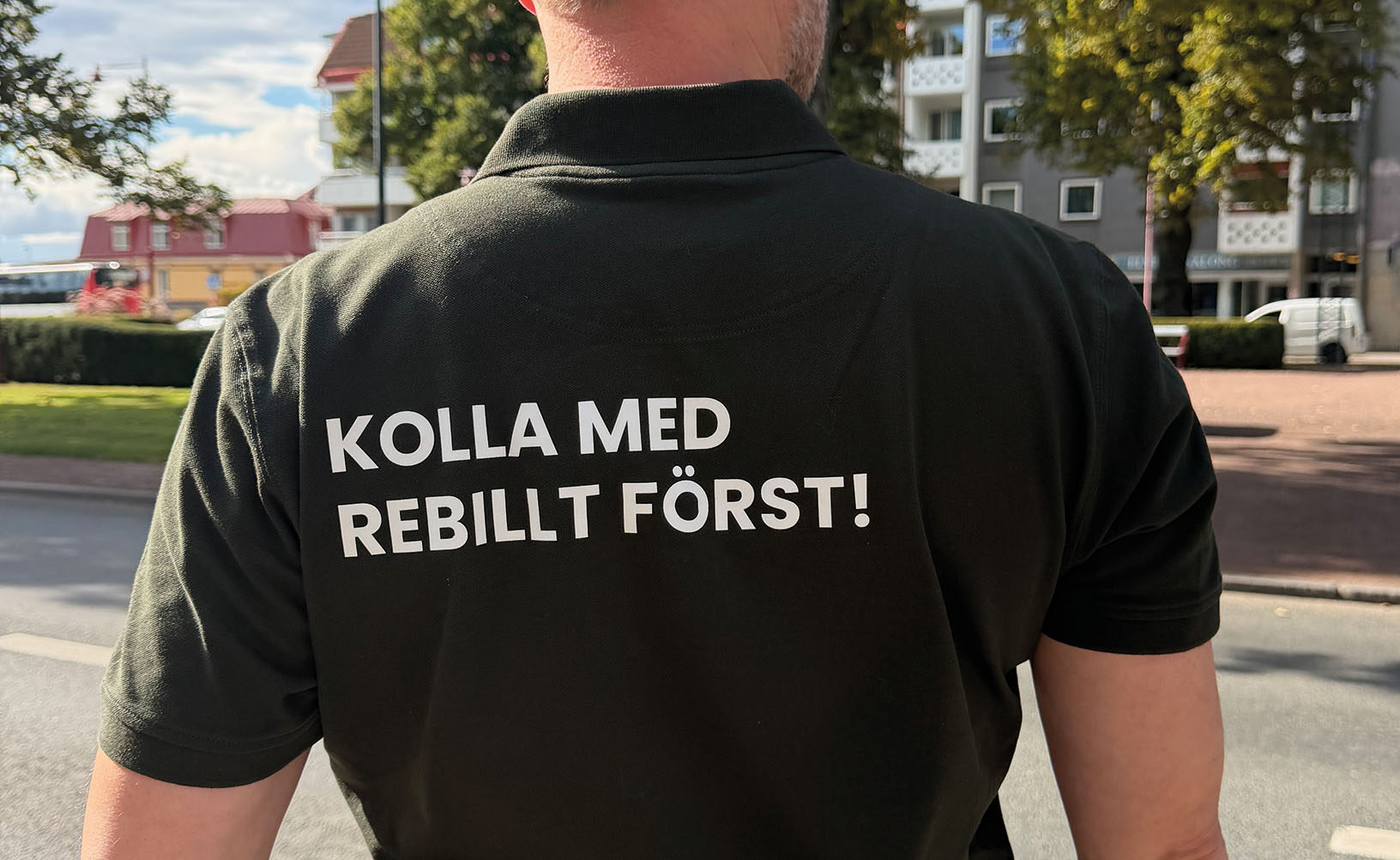
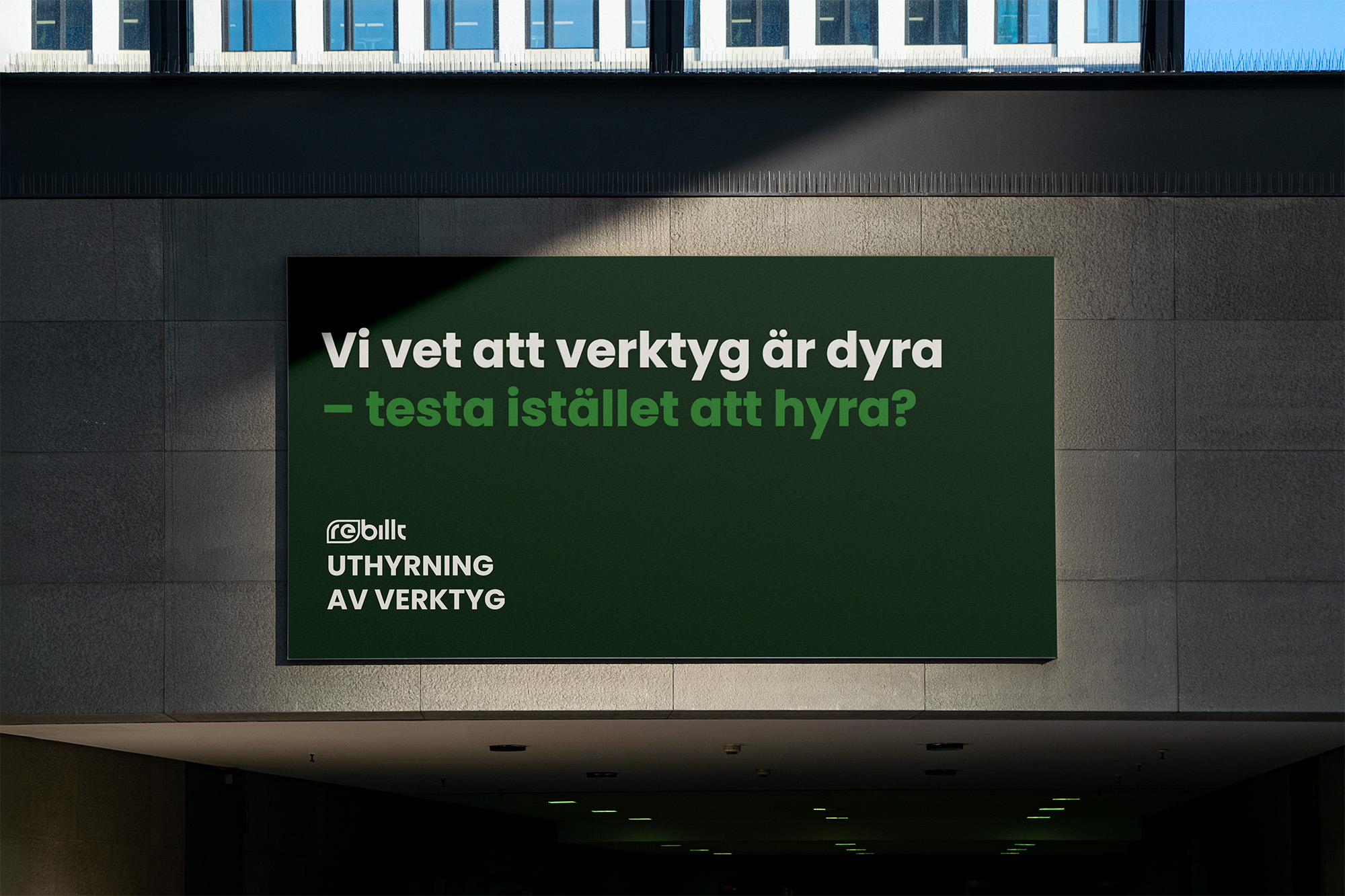
With education, construction planning and the store concept "Circular building materials store" Rebillt creates climate awareness within the construction industry without forcing higher costs. With a tight budget and just a few months of part-time work , I have developed an identity, website, campaign and materials for store establishment, profile clothes, printed materials...
VISUAL IDENTITY
the opposite
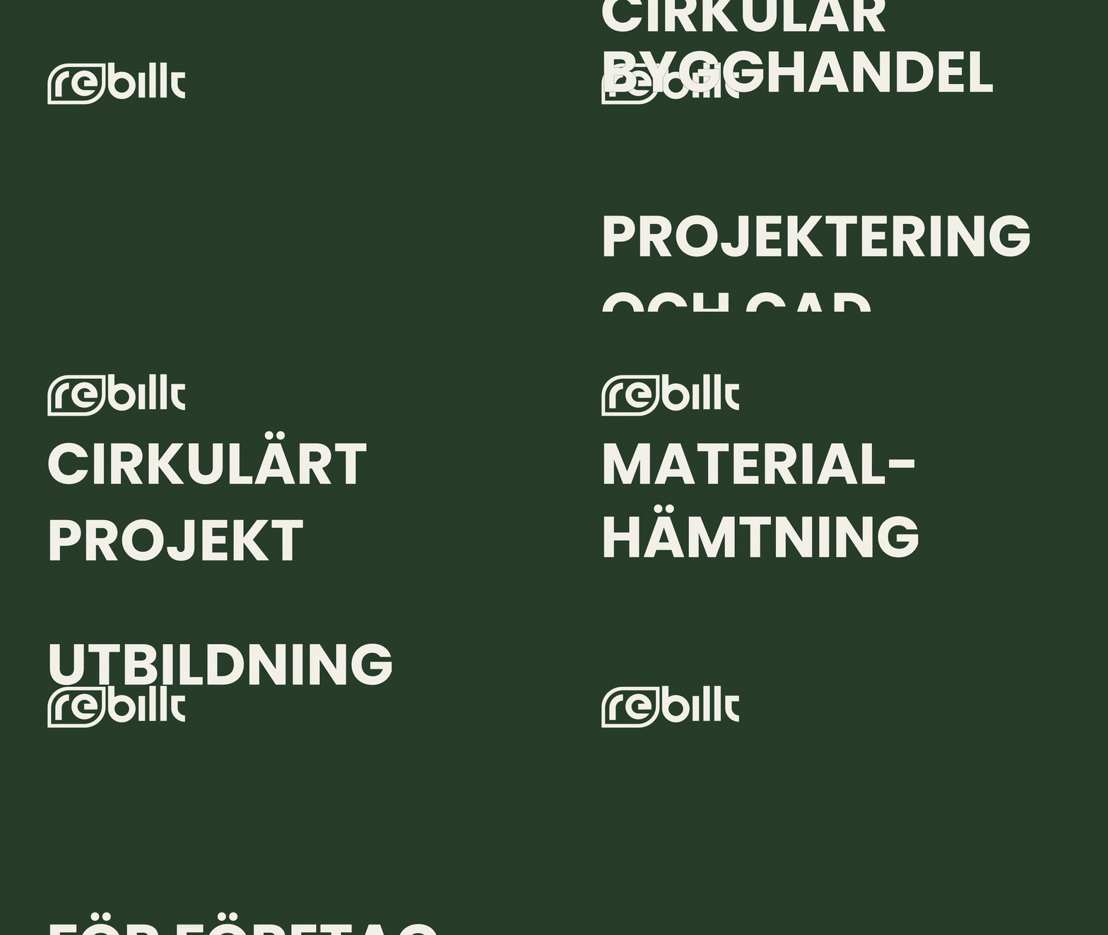
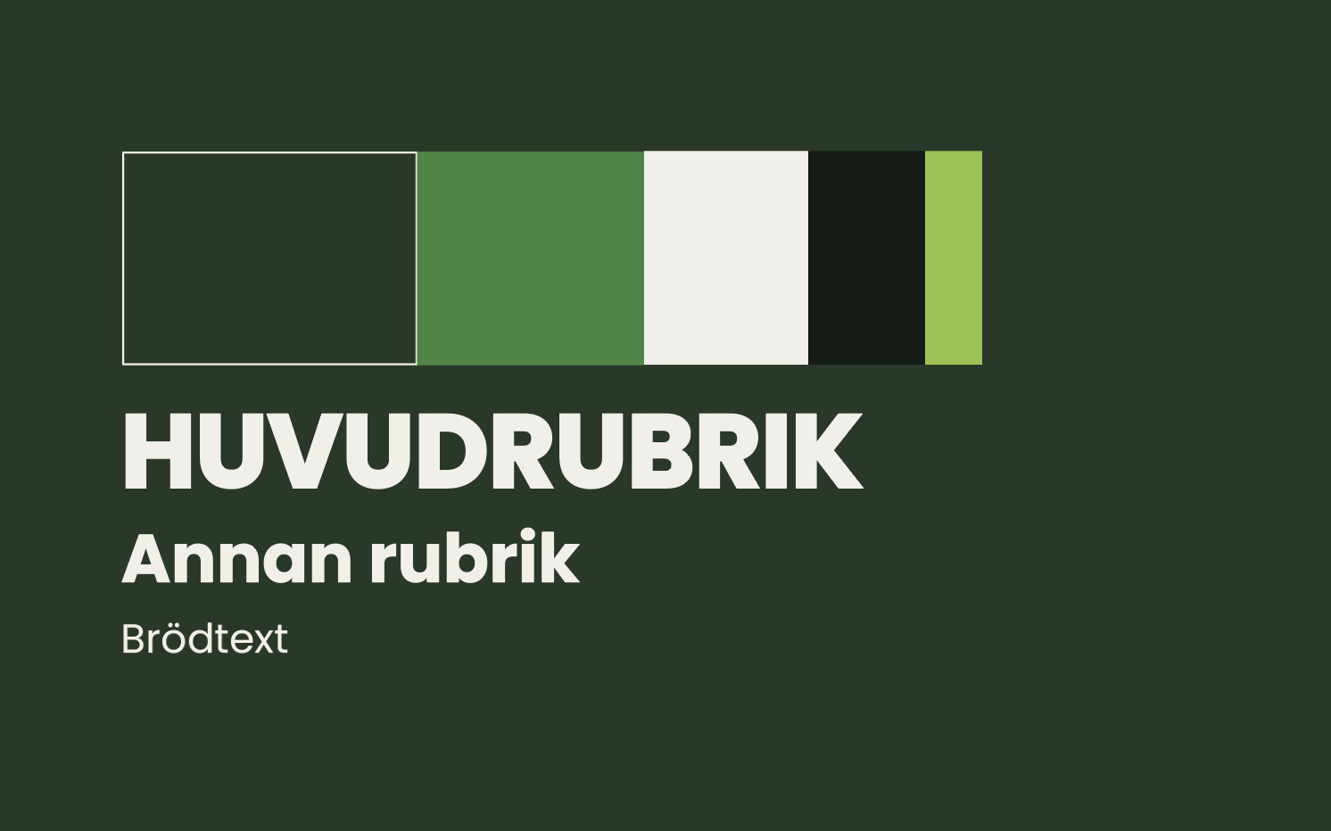
In normal cases, the identity must reflect the company's activities, but in Rebillt's case I ended up with the opposite. Why? Perhaps goes without saying because Rebillt mainly offers used and leftover building materials! In short, I wanted to make the identity feel the opposite of used and left over. Rebillt must be modern, neat and accurate.
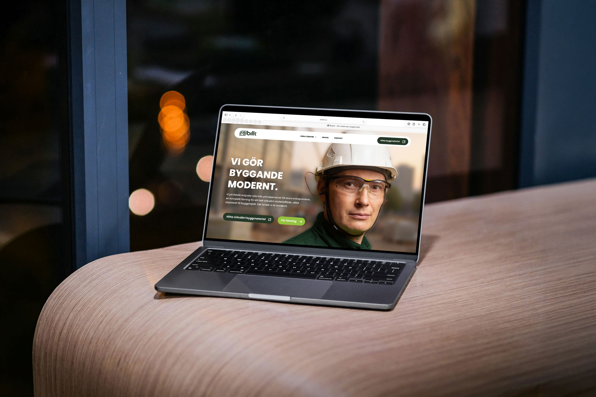
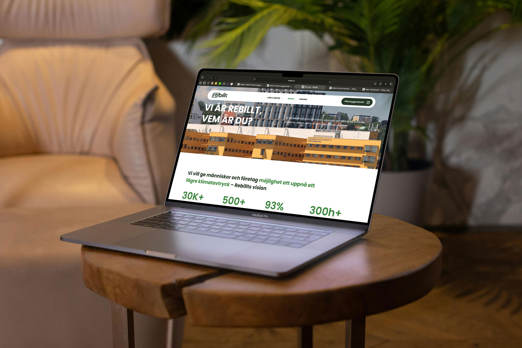
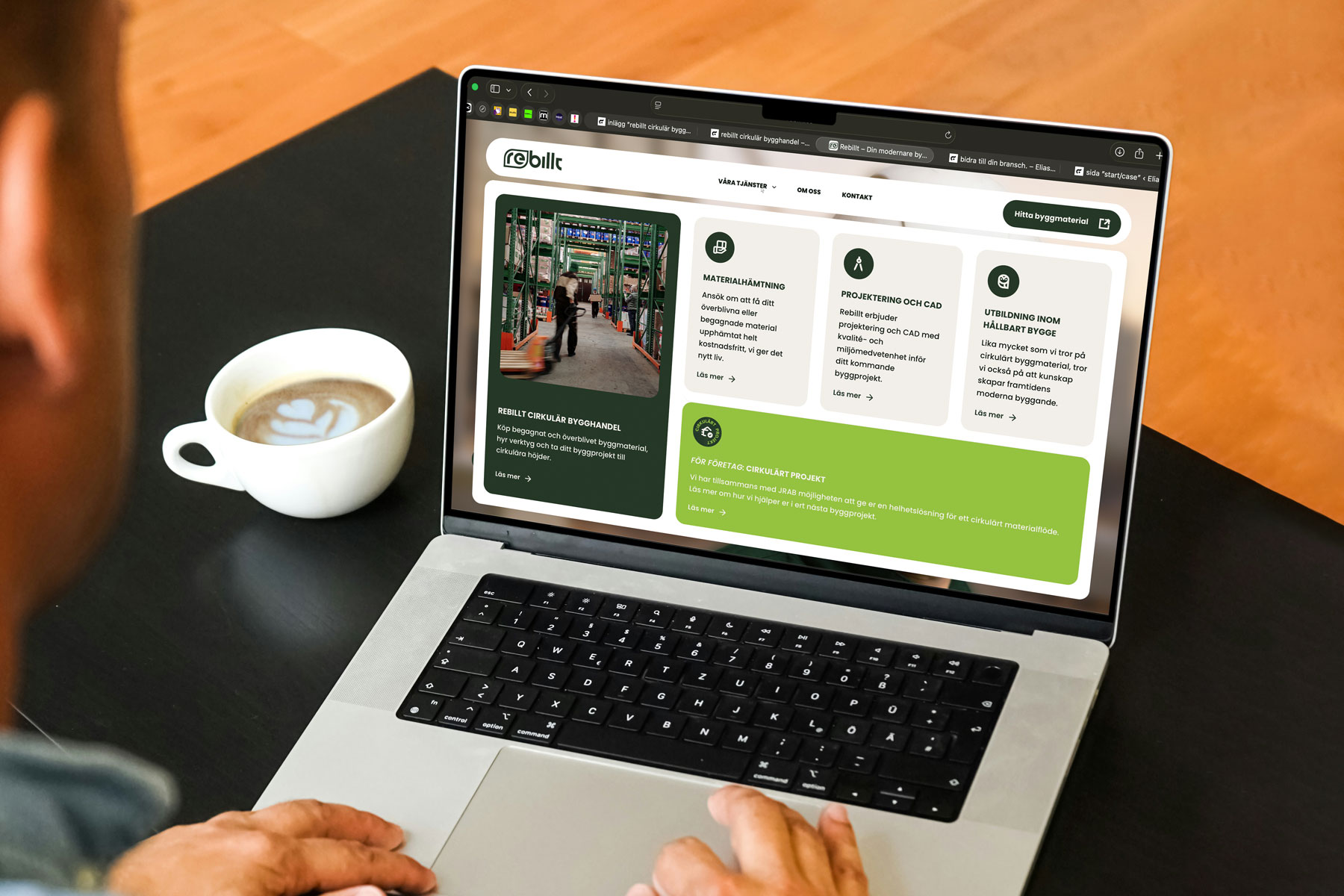
WEB PAGE
WITH A PURPOSE
- Create interest in Rebillts offers,
- och lätt navigera till webbshoppen
är de två huvudsyften som hemsidan ska uppfylla.
Med ett innovativt utseende på förstasidan tycker jag att Rebillt upplevs mer som en modern tjänst, än en byggsecondhand. Ett bra förstaintryck skapar nyfikenhet för vad företaget har att erbjuda. Tillsammans med en CTA till webbshoppen är huvudsyftena uppfyllda.
STORE ESTABLISHMENT
restart for the company
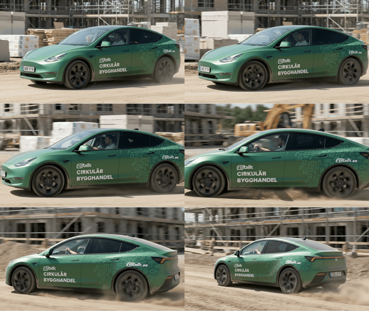
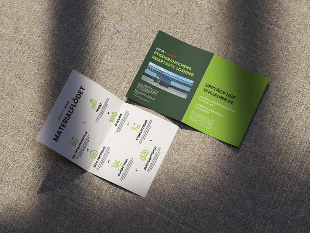
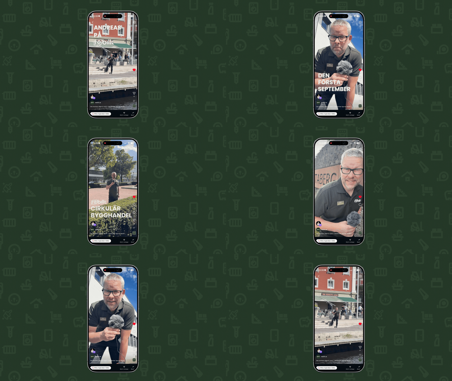
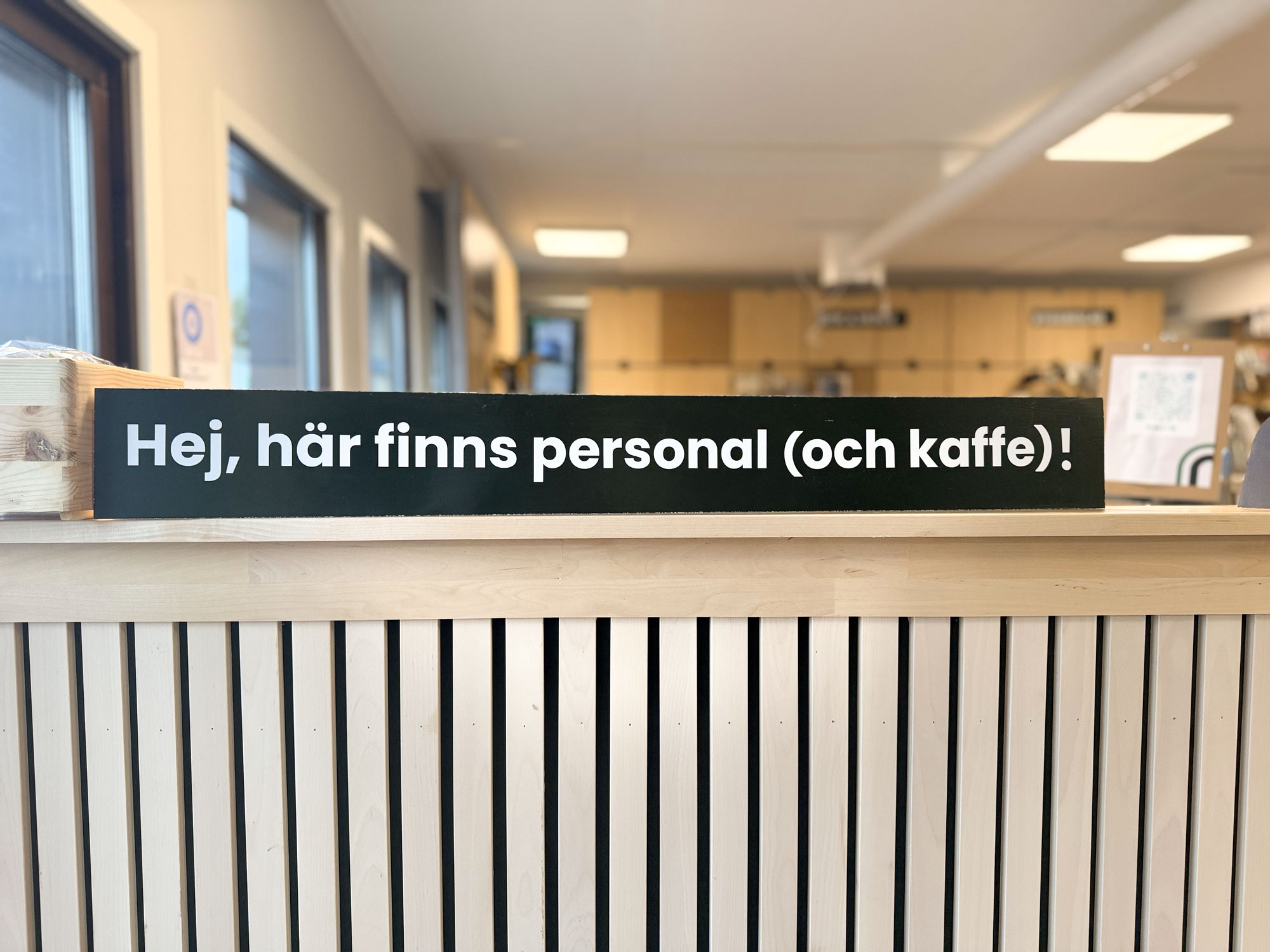
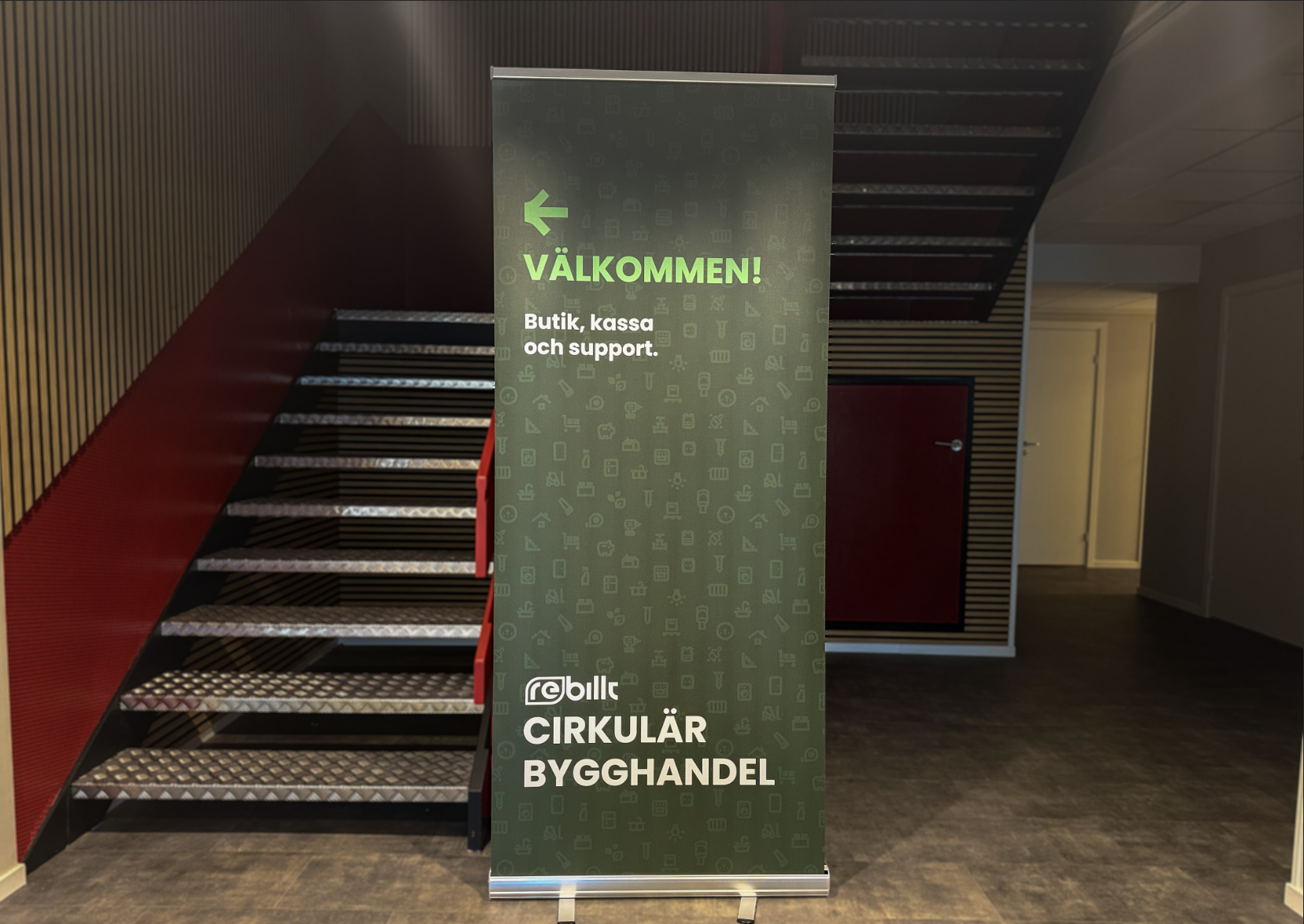
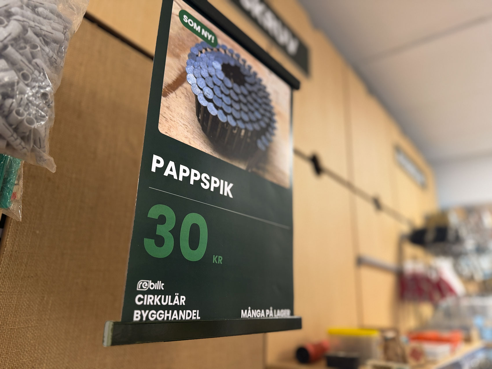
Despite high ambitions about being a modern circular building materials store, the company has until the fall of 2026 been located in more or less a garage. Now that they are expanding outside this garage and working towards that high ambition, I believe a strong identity and brand across all communications is vital.
INTRODUCTION
WE MAKE CONSTRUCTION MODERN.
With education, construction planning and the store concept "Circular building materials store" Rebillt creates climate awareness within the construction industry without forcing higher costs. With a tight budget and just a few months of part-time work , I have developed an identity, website, campaign and materials for store establishment, profile clothes, printed materials...
VISUAL IDENTITY
the opposite
In normal cases, the identity must reflect the company's activities, but in Rebillt's case I ended up with the opposite. Why? Perhaps goes without saying because Rebillt mainly offers used and leftover building materials! In short, I wanted to make the identity feel the opposite of used and left over. Rebillt must be modern, neat and accurate.
WEB PAGE
Hemsida med syfte.
- Create interest in Rebillts offers,
- och lätt navigera till webbshoppen
är de två huvudsyften som hemsidan ska uppfylla.
Med ett innovativt utseende på förstasidan tycker jag att Rebillt upplevs mer som en modern tjänst, än en byggsecondhand. Ett bra förstaintryck skapar nyfikenhet för vad företaget har att erbjuda. Tillsammans med en CTA till webbshoppen är huvudsyftena uppfyllda.
STORE ESTABLISHMENT
restart for rebillt
Despite high ambitions about being a modern circular building materials store, the company has until the fall of 2026 been located in more or less a garage. Now that they are expanding outside this garage and working towards that high ambition, I believe a strong identity and brand across all communications is vital.