
the association of
public education
Work: Visuell identitet / logotypdesign / webbdesign
Client: The association of public education

INTRODUCTION
More than knowledge
When my classmates and I developed the visual identity for the association of public education (APE), we quickly understood that education is not the same as knowledge. Education is about growing as a person, grow as a democratic citizen and to understand oneself and the world around. The APE functions as a collaborative body between various universities, study associations and voluntary associations to promote public education.
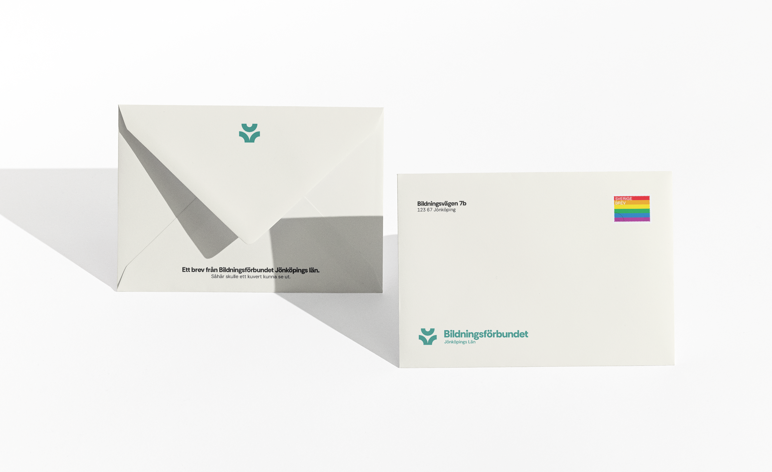
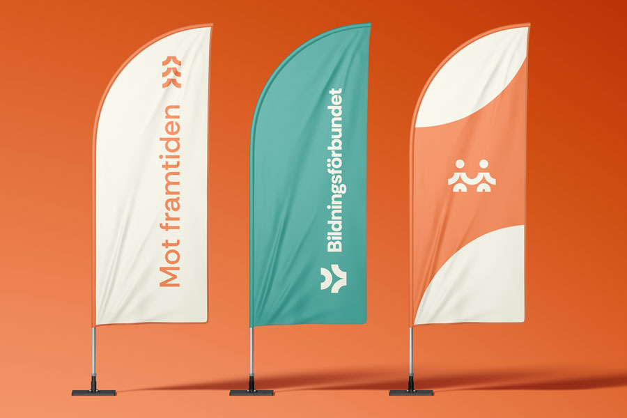
VISUAL IDENTITY
A stable and living system.
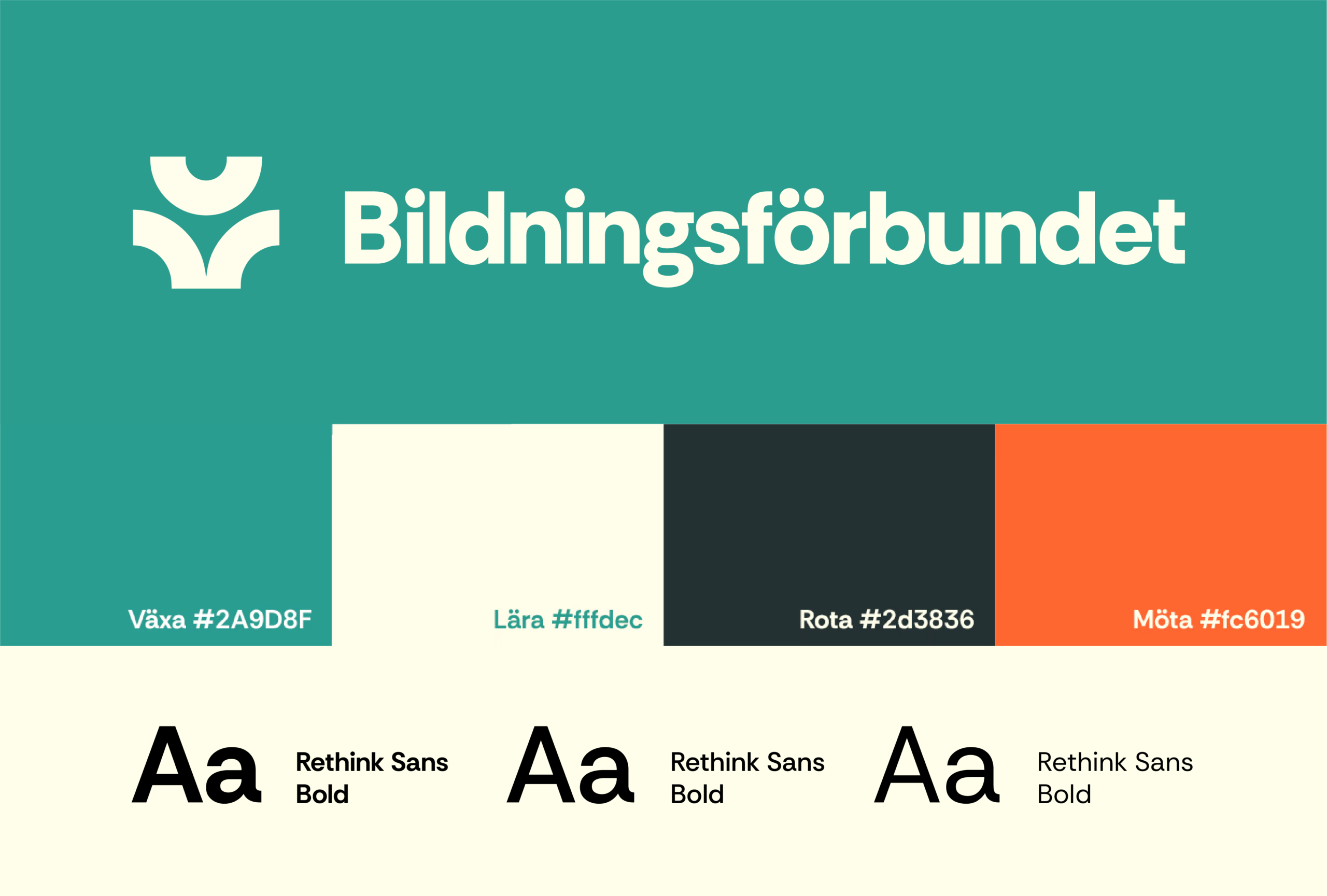
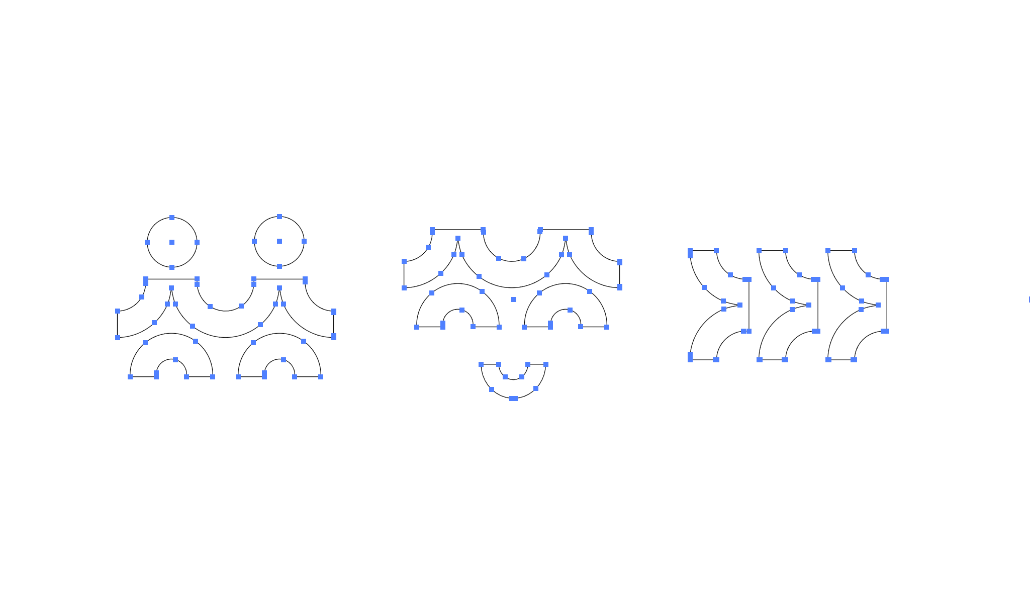
The visual identity is built on innovative fonts and vivid colors. Together with the symbols "ena", "engagera" and "växa" (in that order) they create a system that absolutely defines public education.

IDEA BEHIND THE LOGOTYPE
HUMANS THAT GROWS.
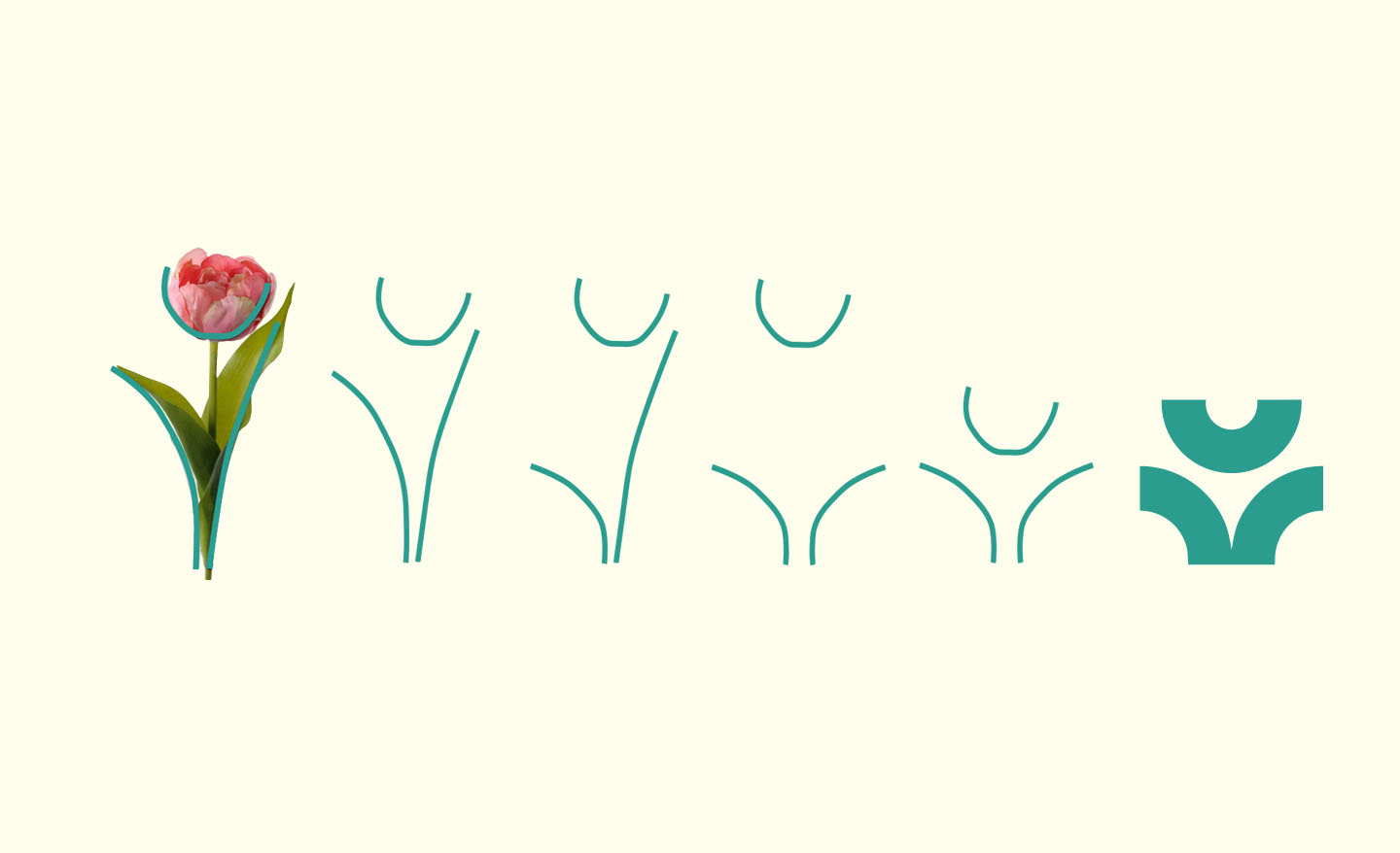
The whole role of public education is about people growing. That's why it was natural to base the logo on one of, in my opinion, the most beautiful plants. By simplifying the shape of the tulip, we got a both flexible and functional logotype, that actually turned out quite nice!
INTRODUCTION
EDUCATION - MORE THEN KNOWLEDGE
När jag och mina klasskompisar tog fram den visuella identiteten för Bildningsförbundet förstod vi snabbt att bildning inte är samma sak som kunskap. Bildning handlar om att växa som människor, grow as a democratic citizen and to understand oneself and the world around. The APE functions as a collaborative body between various universities, study associations and voluntary associations to promote public education.
VISUAL IDENTITY
A stable and living system.
The visual identity is built on innovative fonts and vibrant colors. Together with the symbols called unite, engage and grow (in that order), they create a system that absolutely defines public education.
IDEA BEHIND THE LOGOTYPE
HUMANS THAT GROWS.
The whole role of public education is about people growing. That's why it was natural to base the logo on one of, in my opinion, the most beautiful plants. By simplifying the shape of the tulip, we got a both flexible and functional logotype, that actually turned out quite nice!